- Style Process
- IxD Process
- Wireframes
STYLE PROCESS
Defining Visual Aesthetic
My website will showcase a sleek, modern and immersive look using blacks or rich tones for the background. There will be vibrant accent colours which contrast against the dark background. This contrast of colours, will enhance readability, ensuring that the text and UI remains clear. This use of colour palate showcases creativity, as the dark background will allow for the colourful visuals to stand out. This will allow for my portfolio work to stand out.
Fonts
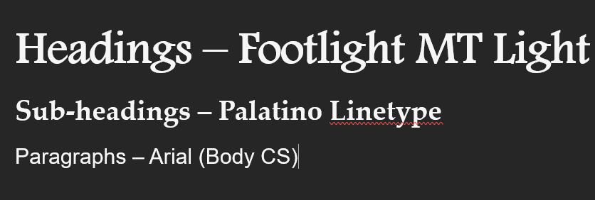
The fonts I chose are used to create effortless reading for the user. For the headings I have chosen to use the font, Footlight MT light, which has thin graceful letterforms. It gives a classic and professional look but adds a creative element with the curves in the letters. For sub-headings I have decided to go with Palatino Linotype, which contains a modern and classic touch to it. It is slightly simpler than the heading, to create a contrast between the information types. For paragraphs I have decided to go with Aptos (body) which is a highly readable, due to its simplicity in its lettering. The paragraphs will be the main part of the text, so I need to ensure that it is easily readable for users.
Colour Scheme
Primary Palette
Secondary Palette
Colour Analysis
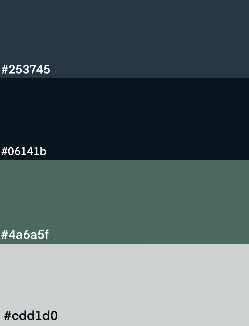
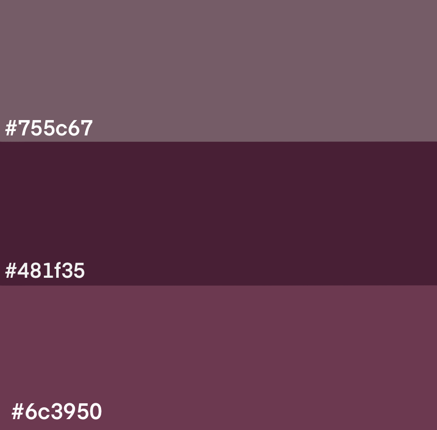
The primary palette of the website contains a variety of pastel greens and blues to represent the brand of the website. The background of the website will be a dark blue, which is contrasted by the light grey and pastel blue and green. The secondary colours is a range of pastel pinks, to add some pops of colour into the website. These colours contrast the blue and green tones which will be the dominant colours for the website.
Composition
The composition of my website will focus on clarity, engagement and creative flow. The website will contain whitespace, to reduce clutter and make elements stand out against the dark background. To create a visual hierarchy, Headings will be large to stand out compared to text and images. There will be adequate spacing in between text to ensure readability.
Interface elements
Navigation Bar
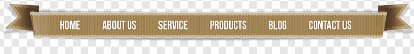
https://www.pngegg.com/en/png-bhewg
The navigation bar will contain a light grey colour with black text, which will create a contrast from the dark background of the website. The navigation will reach across the top of the page and will be shape like a ribbon. This will introduce the creative goal of the website.
Footer Page
The footer page will be a light grey colour, like the navigation bar, creating visual harmony between the start and end of the page. When users hover over the links in the footer, images will change the background of the footer. The images will match the link which they are hovering above.
Buttons
The buttons will have a rectangular boarder with rounded edges. The boarder is added to visualize that this is interactable. When users hover over buttons they will slightly increase in size, visualizing the button is interactable.
Breadcrumb Navigation
The navigation bar will be placed to the left of the website, allowing for readers to read from left to right. It will have a rectangular boarder with round edges, which creates visual consistency in the website, as the buttons contain the same boarder.
Reference material
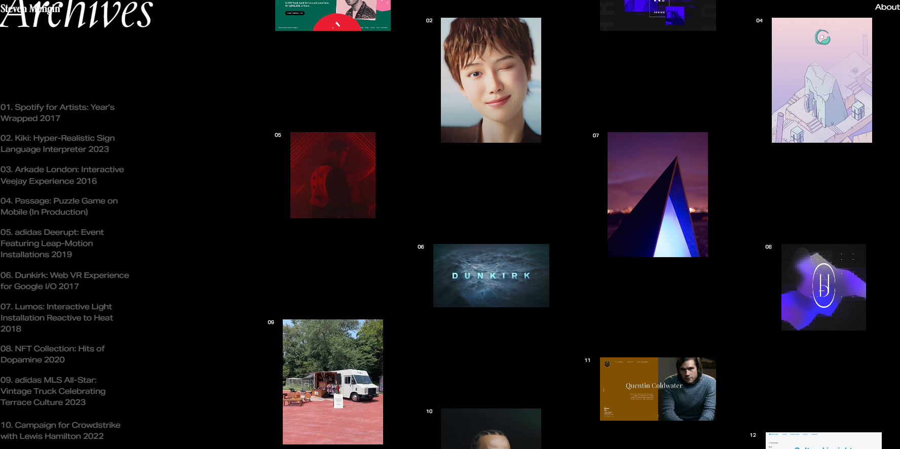
I like the dark thematic feel of Steven Mengin’s website. The background of the website is black, and there are pops of colour in the images. I will incorporate this into my website, but I would want to add more colour, in text and in icons. In this website, you have cursor which changes into an arrow when you hover over images, allowing you to switch between images. I like the idea of adding in creative elements and I will explore adding more creative elements like this. At the footer of the website, if you hover certain texts, the background image changes. This is creative idea, which I will implement into the website, as it aligns with my goal of creativity.
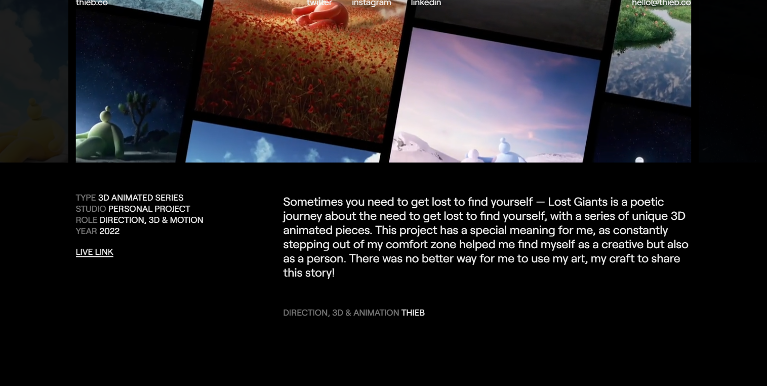
In this website, it continues with the dark aesthetic and pops of colour which I want to incorporate into my website. As you are scrolling through the website, the text and images fade onto the screen. This is something I would like to add to my website, it is creative. When the text fades in, its stays static allowing for users to read the information. This creates a balance between creativity and readability.
https://wits-digital-arts-interactive-media.github.io/WSOA3028A_2549309/index.html
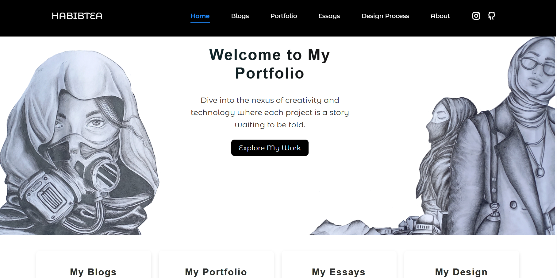
I was inspired by the clean and professional look of the website. The website contains a lot of creative elements in its art and layout but still contains a minimalistic style which doesn’t overwhelm the user with information.
References
Mengin, S. (n.d.). Steven Mengin. [online] http://steven. Available
at: https://www.stevenmengin.com/.
Thieb.co. (2023). Thieb — Multidisciplinary Designer. [online]
Available at: https://thieb.co/ [Accessed 8 Mar. 2025].
Habib, A. (2024). Aaminah Habib’s Portfolio. [online] Github.io.
Available at:
https://wits-digital-arts-interactive-media.github.io/WSOA3028A_2549309/index.html
[Accessed 22 Feb. 2025].