Blog 5
Week 5
Published by Jessica Jardim
Style Guide for Blossom Beauty
In class we were given 1 hour and 45 minutes and a prompt to create a style guide for a website. My group was given the prompt "Blossom Beauty - A South African skincare and fragrance brand specializing in natural products made from indigenous botanicals like rooibos, marula, and baobab. Their eco-conscious approach blends traditional healing ingredients with modern skincare science."
Design Goal
Our website will showcase a minimalistic, clean aesthetic that prioritizes a user-friendly and engaging experience, that is easily navigatable. The website will display the products, through reflecting the richness of South Africa’s landscape.
Mission Statement
We are committed to offer a naturally derived, ethically sourced, and sustainably produced skin care and fragrance products. Made with the purest ingredients, upholding the highest ethical standards.
Audience
Our website will target eco-conscious consumers and wellness enthusiasts, who embrace the benefits of organic ingredients.
Defining Visual Aesthetic
Our website will exhibit a minimalistic aesthetic, showcasing Blossom Beauty’s products, in a manner that is appeasing and easy to the eye. The focus of the website is to emphasize the organic ingredients of the products, which will attract our target audience. Our minimalistic colour palate will create an emphasis on the products to encapsulate their natural origin. These colours will be seen throughout the page, to create consistency, which will not overwhelm the user with change of colour aesthetic.
Colour Scheme
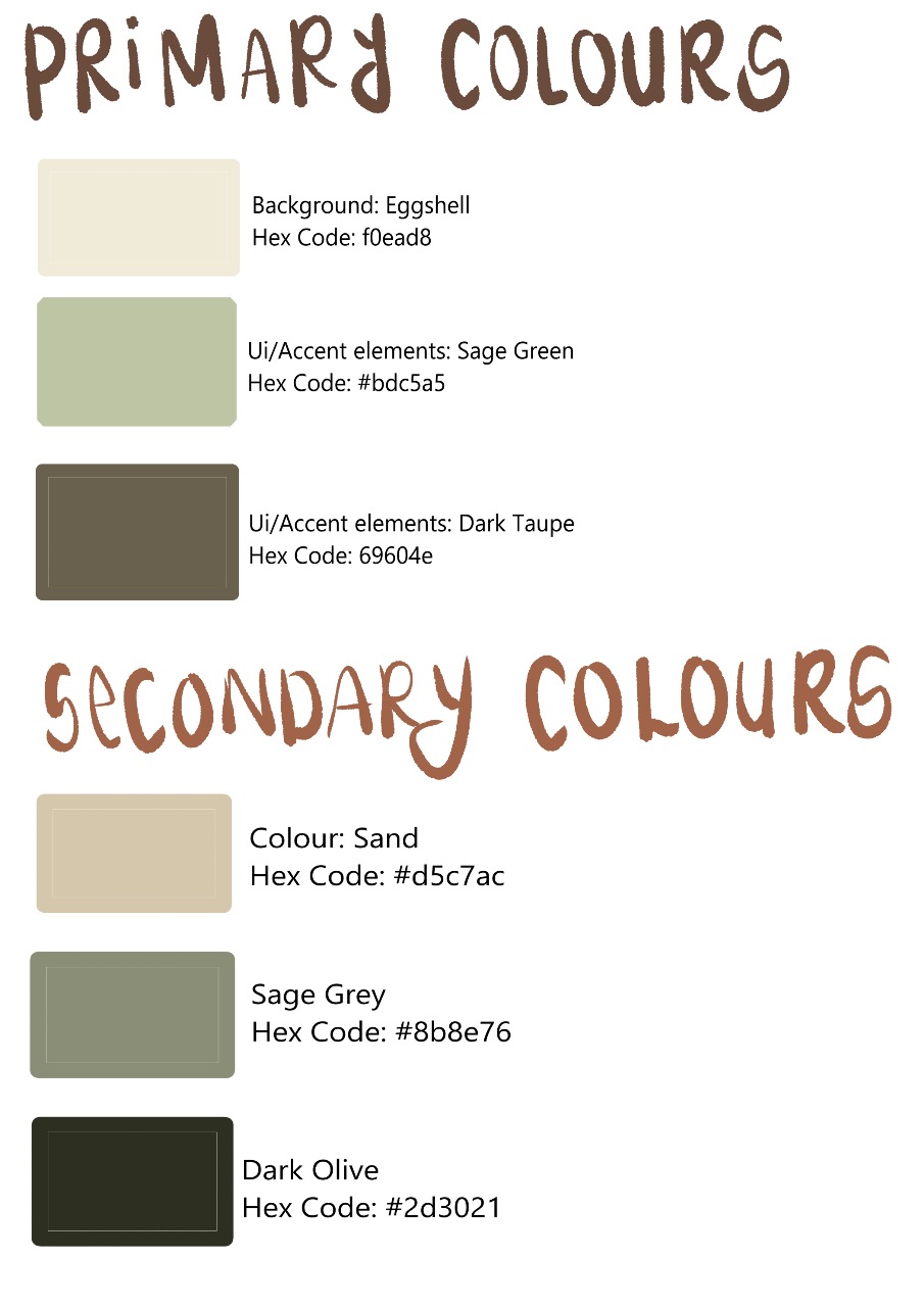
The website contains a neutral background which will emphasise the text and products, as there will be a contrast between the light background and dark text. With the use of different colours for boarders and headings, it leads the viewers eyes through the website, without distracting them. We chose a colour pallate with a variety of greens and browns, to match the natural aspect of the product. We decided to go with a pastel colour pallate to give a soft and clean look to the website, matching the products which are skin care and fragrances.
Fonts
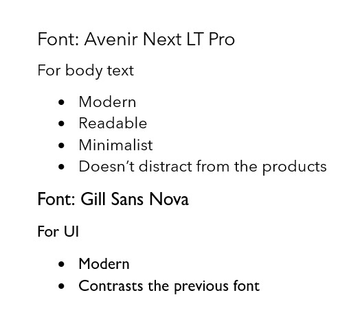
We chose these fonts for a minimalistic look, which doesn't the distract the viewer from looking at the fonts. The fonts that we chose are easily readable, which allows for effortless reading.
Layout
The layout of the website will focus on simplicity and content prioritization. Headers and boarders will be used to separate content, creating visual clarity. The website will be laid out to draw the viewers attention to the product and not get distracted by the design of the website. The images of the product will all be the same size, allowing for visual consistency.
Navigation Bar
The website will contain a navigation bar, which allows the user to easily navigate across the website. The navigation bar will contain links to: Home Page, Fragrance Section, Skin Care Section, Latest Products and a Cart of the products that you have purchased. Within the Fragrance and Skin care section there will have a search bar, allowing users to search products which they desire to look at. There will be a drop-down box which will allow users to categorise the products, such as: Price, Latest Products and size.
Reflection
Creating this style guide was quite stressful given the time limit. We started off discussing what we want the website to look like and what we wanted to acheive with the website. We then split into two groups, one group focused on the visual aestheic, while the other started with the documentation. Our main focus, was to highlight the products. After receiving feedback from one of the tutors, we realised we focused so much on the natural aspect of the product, rather than the actaul products. We didn't add any orange colours for the rooibos products. We should have also added more creative fonts, to add an elegant touch to the website.